When you walk into a room, you sense not just its physical dimensions, but also how open it feels. Through architectural tricks, thoughtful layout, and refinement of visual cues, you can make even compact interiors feel generous and airy. Below is a detailed, research-informed guide to creating interiors that look and feel larger than they are.
1. The Big Picture: Foundations of Spatial Perception
Before diving into strategies, it helps to understand why certain design techniques work. Perception of space isn’t just about area or volume — it’s about cues your eye and brain use:
Lines & sightlines: Continuous visual lines draw your gaze farther, making ceilings or walls recede. Contrast & edges: Strong contrasts and hard boundaries interrupt the illusion of depth. Softer transitions let your eye roam. Light & reflections: Brightness, shadows, and reflective surfaces trick the eye into perceiving more volume. Visual clutter: Too many objects, textures, or competing shapes “fill up” visual space and shrink perceived scale.
With these principles in mind, the following strategies layer together to enhance openness.
2. Use Height to Your Advantage
Even if your ceiling isn’t truly soaring, you can imply height.
a) Tall Ceilings & Vaulted Spaces

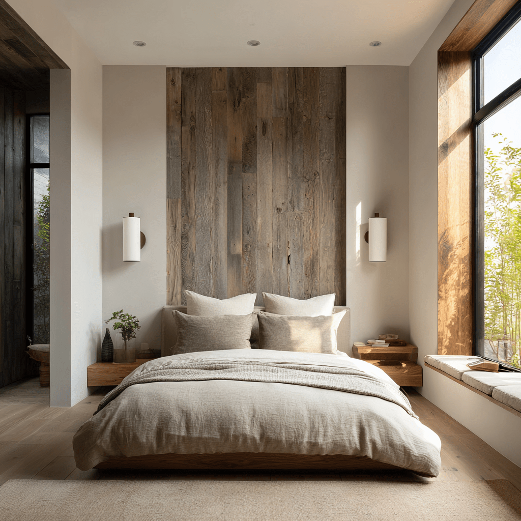
Rooms with actual high ceilings or vaulted forms immediately feel more expansive. Designers often use exposed beams or dramatic rooflines to emphasize vertical space, directing the eye upward.
Tips when you have tall ceilings:
Use lighting that fills vertical space (e.g. upward sconces or wall washers) rather than lots of low-hung fixtures. Decorate walls vertically (tall art, elongated panels, vertical grooves) to emphasize height. Anchor the room with furniture that doesn’t float in the middle; use visual weight near the floor but leave breathing room upward.
b) Creating Illusions of Height

If your ceilings are standard or low, you can “cheat” upward: on
Paint ceilings the same color as walls (or close) so the boundary disappears. This helps eliminate a visual “cap.” Extend vertical elements (e.g. curtain rods, shelves, cabinetry) close to the ceiling to draw eyes upward. Real Simple suggests installing rods significantly above the window frame to elongate the impression of height. Use narrow vertical stripes or banding, subtly guiding the eye upward.
3. Embrace Minimalism & Restraint
One of the most powerful ways to make a space feel roomy is simply to not clutter it. Minimalism isn’t just a style; it’s a spatial strategy.
Remove unnecessary furniture and decor. Every item you include consumes “visual real estate.” Use fewer, but more purposeful, pieces. Allow breathing room around each to let the eye rest. Favor neutral, light, or muted palettes (off-whites, pale grays, soft beiges). These reflect more light and reduce harsh contrast transitions. Use materials with subtle texture rather than bold, busy patterns. This keeps surfaces from fighting for visual attention.
Minimalism also pairs well with multifunctional furniture (e.g. storage ottomans, fold-away desks) so that you don’t need many stand-alone pieces.
4. Favor an Open Floor Plan & Flow

Walls, partitions, and closed rooms break up visual continuity and trap the eye. When possible:
Adopt an open-concept layout (e.g. kitchen/living/dining flowing into one volume). This reduces barriers and lets light and sightlines extend. If you need separation, use partial dividers (screen panels, open shelving, glass partitions) that allow sight through. Align doorways and windows so you have diagonal lines of sight through multiple rooms.
This sort of spatial layering was an idea championed by architect Sarah Susanka with her “Not So Big” philosophy: thoughtful connections and gradations in space allow interiors to feel generous without needing huge floor area.
5. Light, Reflection & Transparency
Light is among the most potent tools for creating openness. Combined with reflection and transparent materials, it can virtually expand space.
a) Maximize Natural Light
Allow natural light to flood in.
Use large windows or even walls of glass where feasible. Avoid heavy window treatments that block or interrupt light. Instead opt for sheer or minimal shades. Position mirrors to reflect windows or views outward.
b) Use Reflective Surfaces
Mirrors, glossy finishes, or polished metals multiply light and visually “pierce” walls. Many design guides list them as key tricks for small-room illusions.
c) Transparent or Open Furniture
Clear acrylic or glass tables and chairs “disappear” more than solid ones, leaving space visually open.
6. Control Scale, Proportion & Furniture Placement
Having the right furniture in the right place is pivotal.
Avoid low-profile, squat pieces that make walls feel close. Rather, use seating with legs or open bases so floor is visible beneath. Choose furniture sized proportionally — not too large (which crowds) and not too small (which emphasizes emptiness). Float furniture away from walls a bit to allow circulation behind and avoid the “pinned to the wall” look. Use rugs that cover large areas rather than small accent rugs: a too-small rug breaks the visual plane and shrinks the room. Use symmetries or consistent spacing to give order and reduce visual jitter.
7. Color, Contrast & Edge Treatments
Color isn’t just decoration — it’s a critical tool for shaping perception.
Use a consistent color flow across connected rooms. When adjacent spaces share a palette, boundaries dissolve. Avoid harsh contrast at edges (e.g. a dark baseboard sharply contrasting a light wall). Instead, use soft transitions or uniform tones. In some cases, accent walls can help push back or pull forward, but they must be used judiciously so they don’t cut into the illusion. Use tonal gradation (light to slightly darker) to suggest depth without visual interruption.
8. Layers of Lighting (Not Just One Big Fixture)
Proper lighting is essential — darkness collapses space.

Use ambient, task, and accent lighting together so the room is evenly lit rather than spotlighted. Use wall sconces or uplights instead of many downward pendants that clutter the ceiling plane. Wall washing: lighting that evenly illuminates walls helps flatten shadows and open space. Avoid large, heavy light fixtures that interrupt the “air” overhead.
9. Smart Use of Details & Accessories
These finishing touches carry disproportionate weight in the spatial illusion.
Use a few well-placed large-scale art pieces rather than many small ones, which fragment space. Keep accessories off the floor. Use wall-mounted shelves or floating furniture to preserve floor visibility. Maintain negative space — the areas you leave empty are as important as what you fill. Limit pattern mixing. Too many competing patterns fragment the visual field.
10. Summary: An Integrated Approach
Designing interiors that feel larger than their footprint is rarely about one trick—it’s about layering many complementary strategies: height, openness, light, restraint, proportion, and visual continuity.

Leave a comment